CENTENE
Digital Twin Navigation UX
In my capacity as the UX Designer for the Business Process Advisory Services (BPAS) team of Centene, my role was to improve the user experience of iGrafx, a notoriously complex Business Process Management (BPM) software.
My first goal was to make improvements to the navigation experience making it easier for new and infrequent users to find the data they needed.
Project Background
iGrafx is a BPM software that allows organizations to model the processes, architecture, capabilities, risks, goals, and more. This “digital twin” gives everyone from executives to frontline works everything they need to do their best work.
Centene had been using iGrafx for more than 8 years and built a tremendous amount of data into their repository. However, without enterprise funding and support, this effort took place without proper governance or coordination between disparate teams of users. The result was a labyrinth of content and no structure for meaningful reporting.
As a past employee of iGrafx tasked with creating onboarding materials, training systems, in-application tutorials, and documentation, I was keenly aware of the pitfall that Centene and many other companies who use iGrafx fell into. As their new UX Designer, I knew that the highest priority, short term goal was to create a navigation system using dashboards. The model may be confusing, but at least users would have a map.
Journey Mapping and Personas
Journey mapping was completed as a cross-functional exercise with other teams who serve teams’ process modeling needs within iGrafx. Their expertise in Centene touchpoints with iGrafx and its support systems, made this a very enlightening experience.
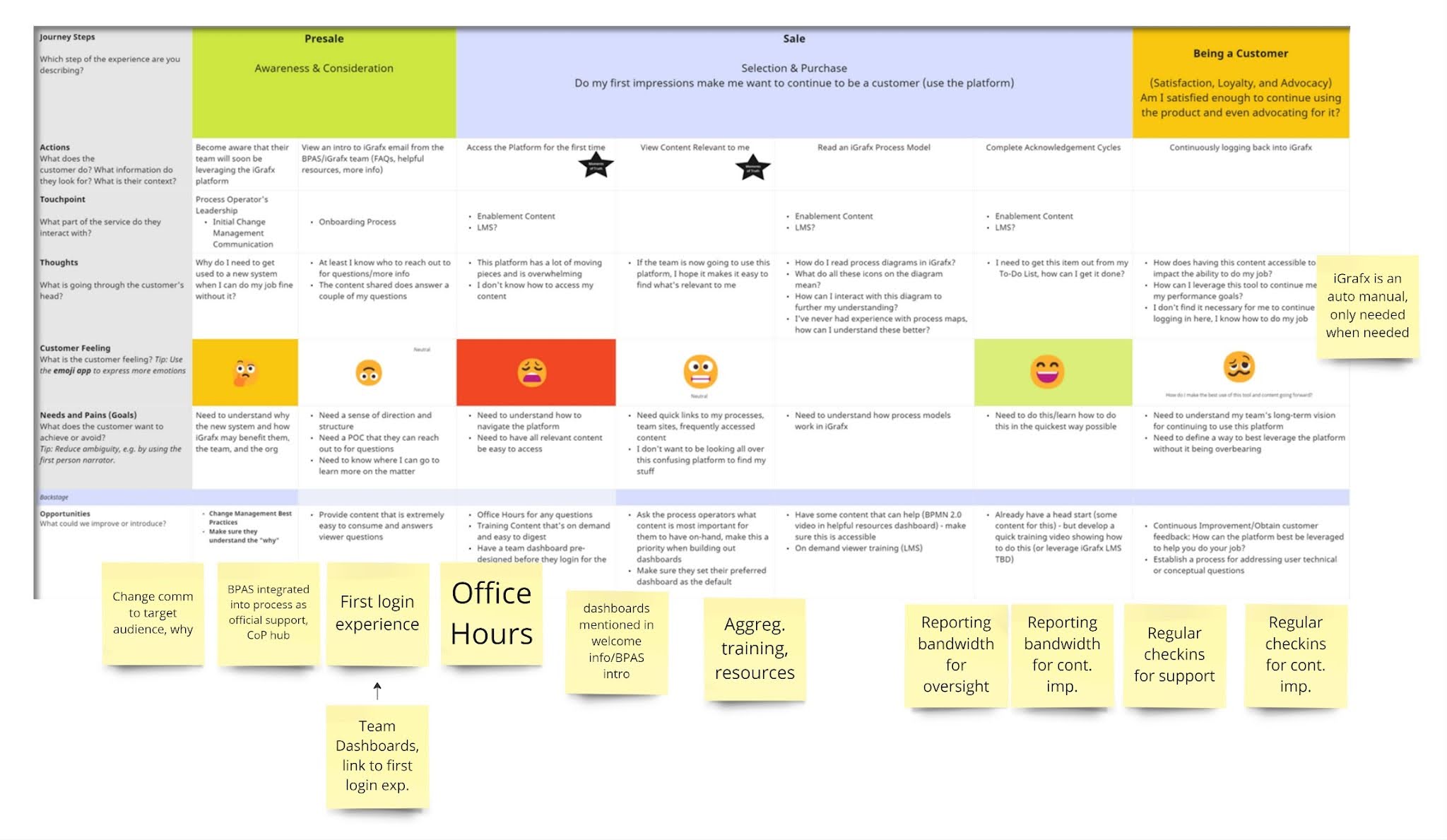
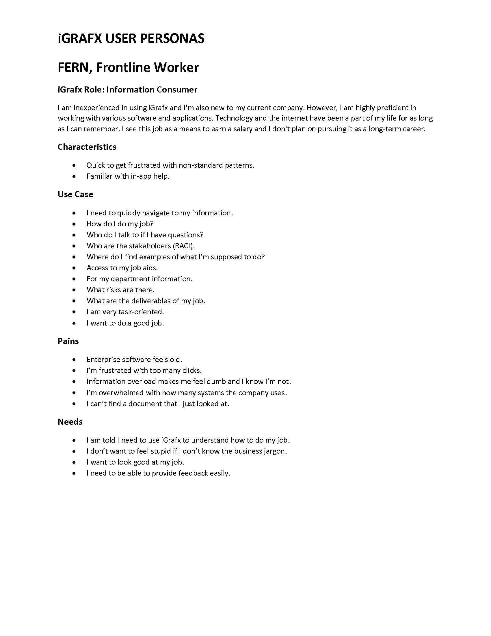
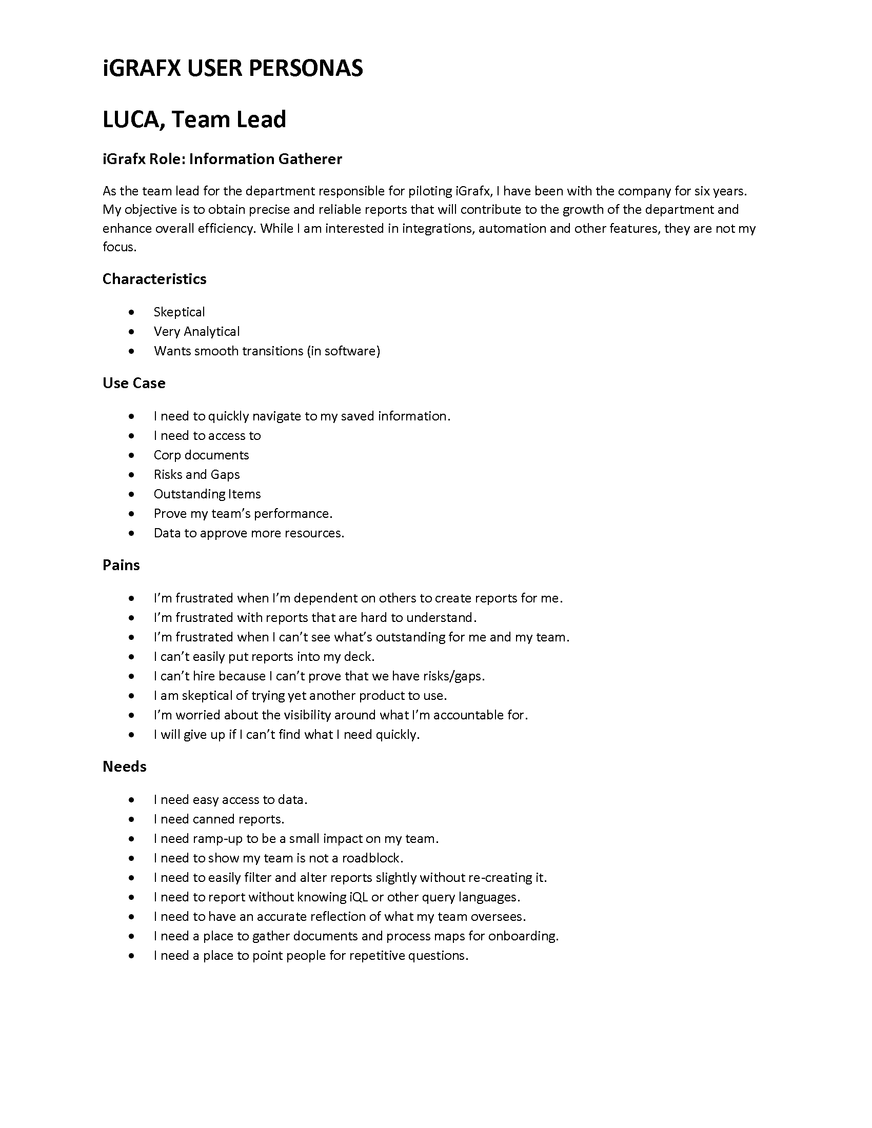
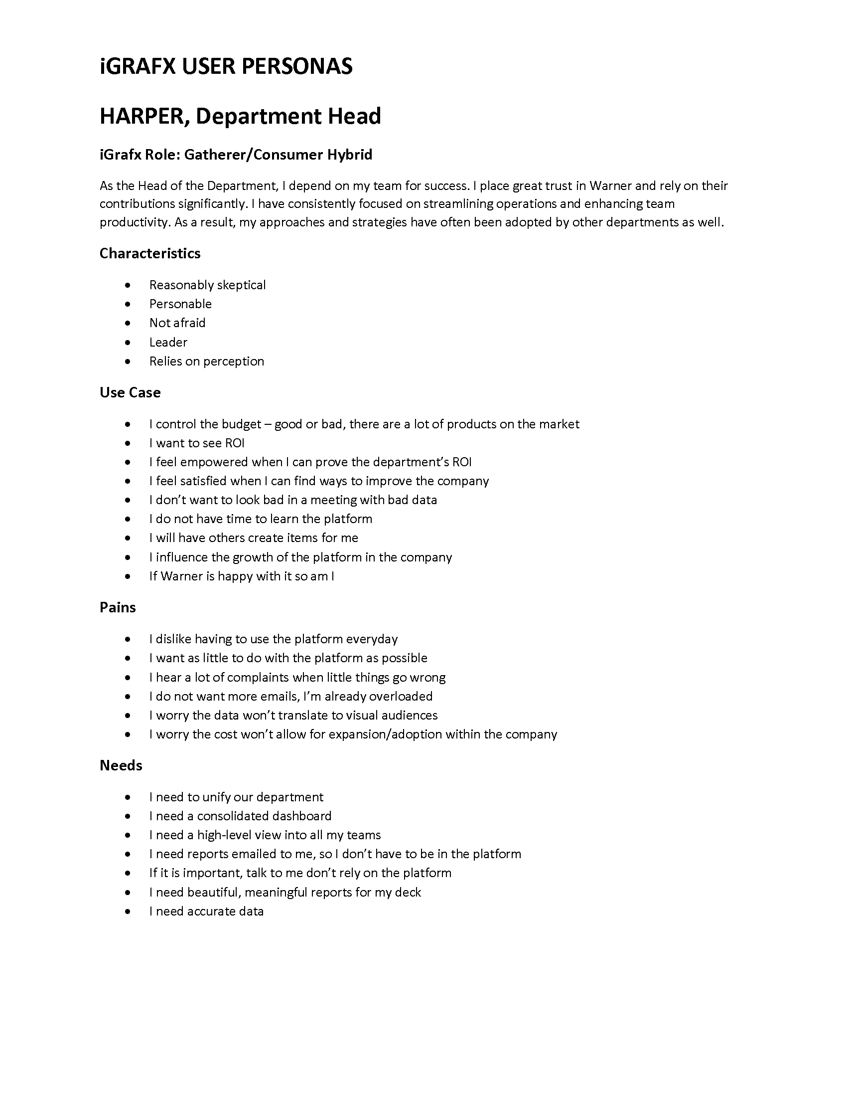
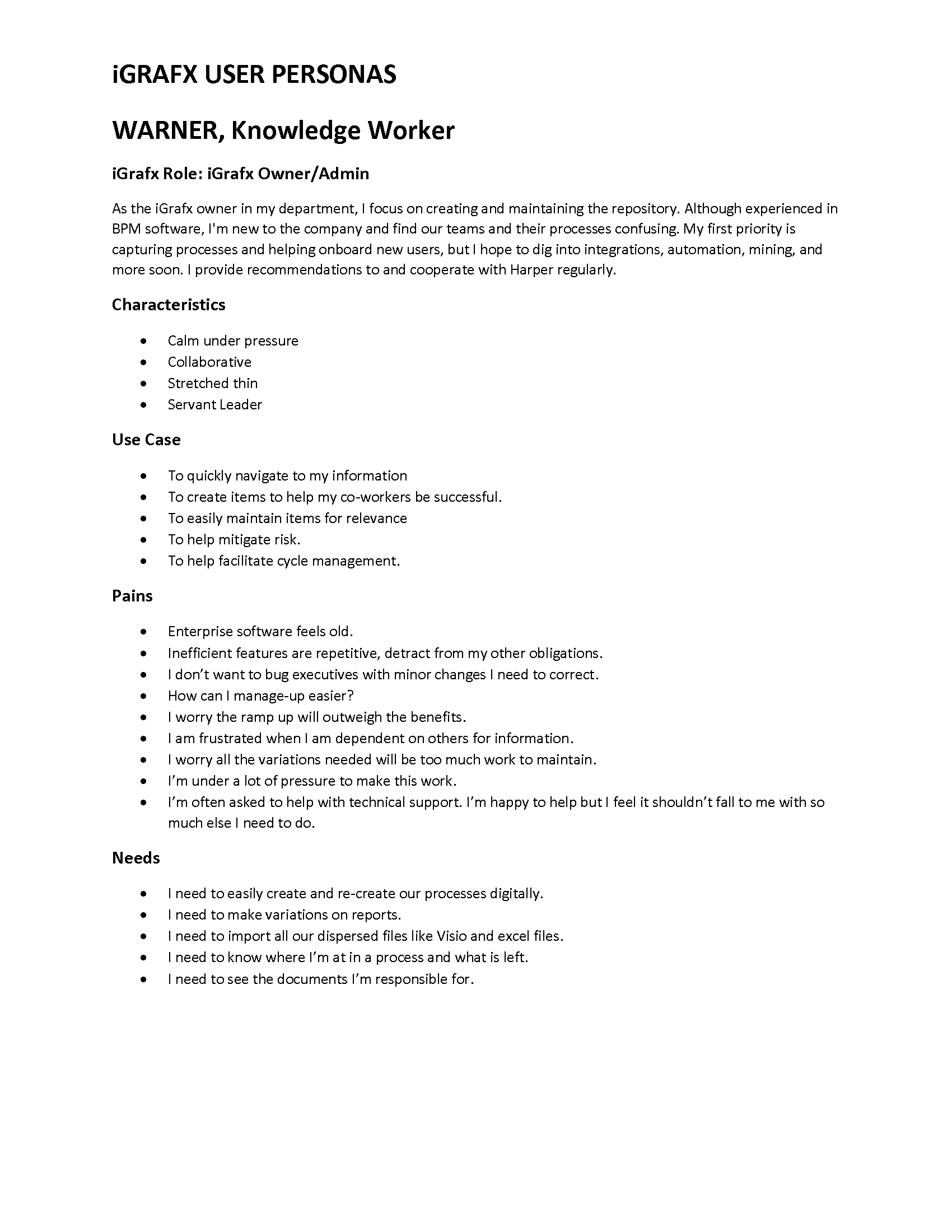
Centene had completed a persona exercise in the past to understand their different types of users, but it was focused too heavily on licenses and their capabilities. I wanted to capture stand-ins for the people trying to do their jobs, what they want, and what they do to get it. Empathizing with user needs is crucial.
Qualitative Research
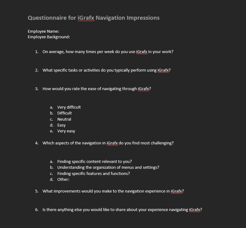
I began by getting to know the power-users of iGrafx. I developed a simple set of standard questions to ask each of the dozen or so team leaders related to navigation, ease of use, and suggestions for improvement.
The feedback I received was near-unanimous. iGrafx is an incredibly difficult tool to learn if you aren’t familiar with BPM software, but once you get used to it, there’s nothing better on the market.
Most feedback related to navigation had to do with the labyrinth of content piling up, which makes it even more difficult for frontline workers to find their process documentation, and for leadership to gain meaningful insights. The number of clicks-to-value became too much.
Quantitative Research
With the power-user feedback gathered it was time to survey the wider user-base. I created a Microsoft Forms survey in coordination with the Communications team and distributed to 1067 of our iGrafx users. The questions focused on the navigation experience in iGrafx but I provided a comment box at the end which gave us insight into the bigger problems related to the scattered implementation.
The feedback was largely negative as expected, but it was important to have a baseline of data to build up from. The comment box was filled with feedback universally unrelated to navigation, about the lack of training, support, direction and governance. This informed the later efforts of my BPAS team.

Click Maps
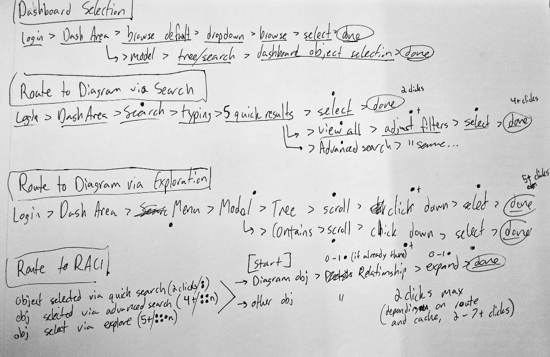
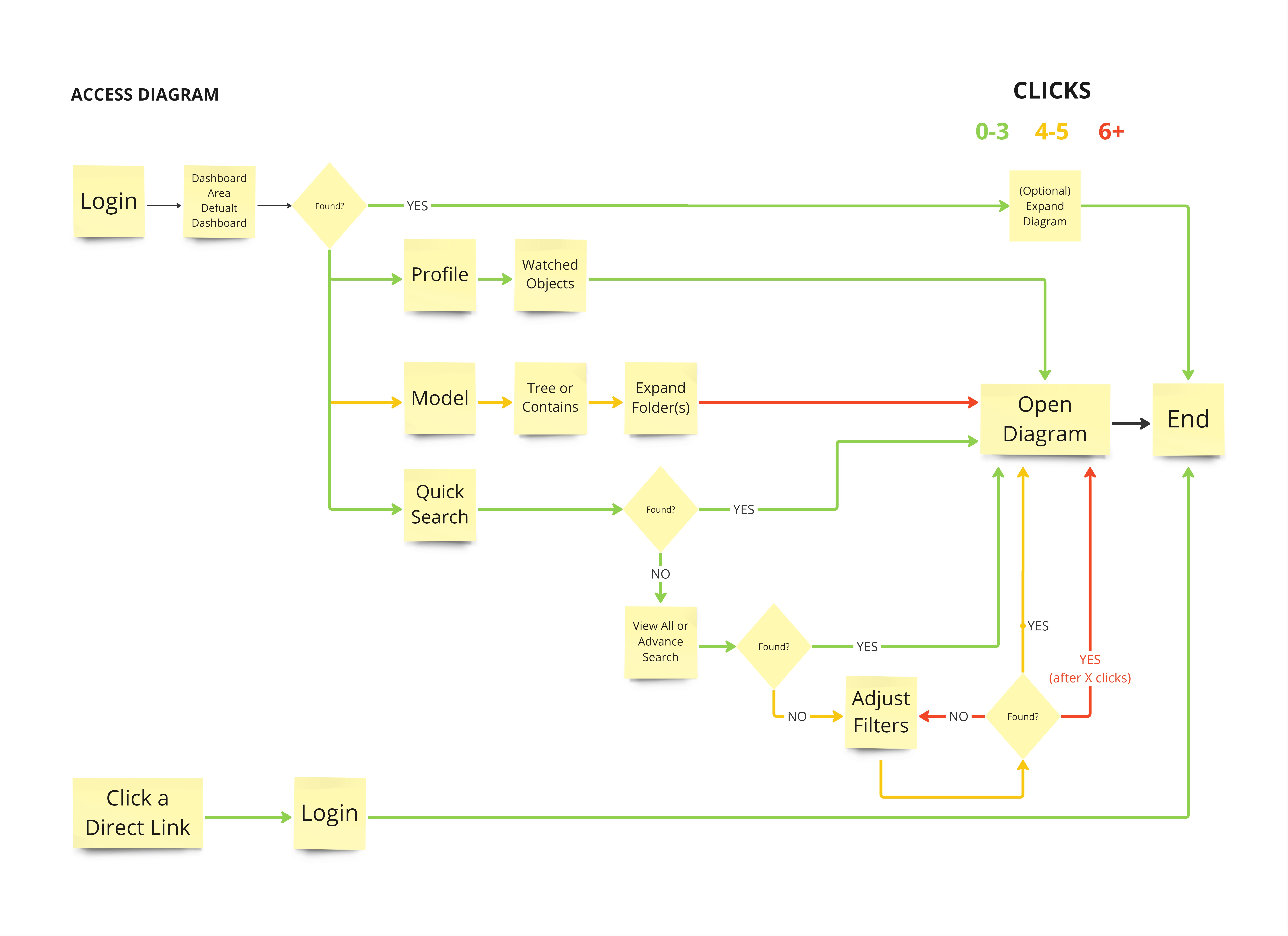
To quantify the distance users have to travel to their content I created click maps to find the best and worst routes to content like diagrams, and compare these to feedback received from our users. Dashboards provided as efficient a route to content as clicking a direct link. The challenge is adequately tailoring dashboards to meet teams’ needs.
Wireframes and Prototypes
With data to back up the decision, dashboards were the way to go. Dashboards in iGrafx are modular, with gadgets that can be moved, resized, and configured into a dozen different types. Gadgets can allow users to display an interactive diagram, a lists of objects, the visualization of a report or performance indicator, rich text and much more. I started sketching gadget arrangements that would offer the most value.
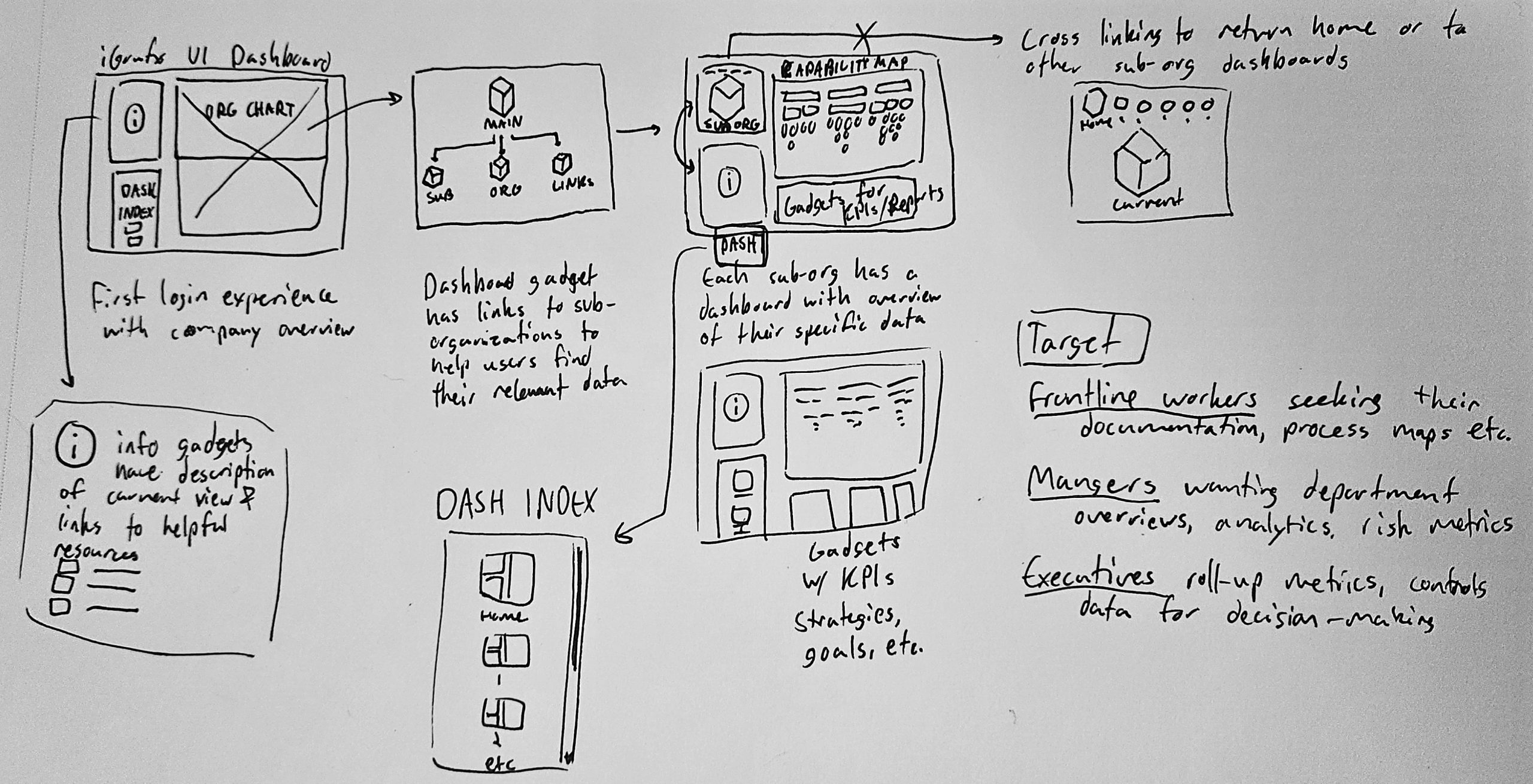
As the sketches refined, the standout elements were the following:
- Information gadgets that provide a brief summary of the view, giving context for the data.
- An index of dashboard linking to the other major views in the repository.
- A “process house” allowing a user to explore the teams and departments of their organization from top to bottom.
- Below-the-fold data gadgets with KPIs, charts, graphics and other metrics relevant to that view.
Next step was to hop into Figma and iGrafx and test its capabilities for importing, exporting, and working with different image file types in diagrams to create robust process houses. I also created test dashboards to test sizing and accessibility of nested content. Diagrams within dashboards can make text and imagery quite small.
The goal is to create a virtual space with landmarks, colors, and symbolism to help users easily find content and remember how to return to it later.
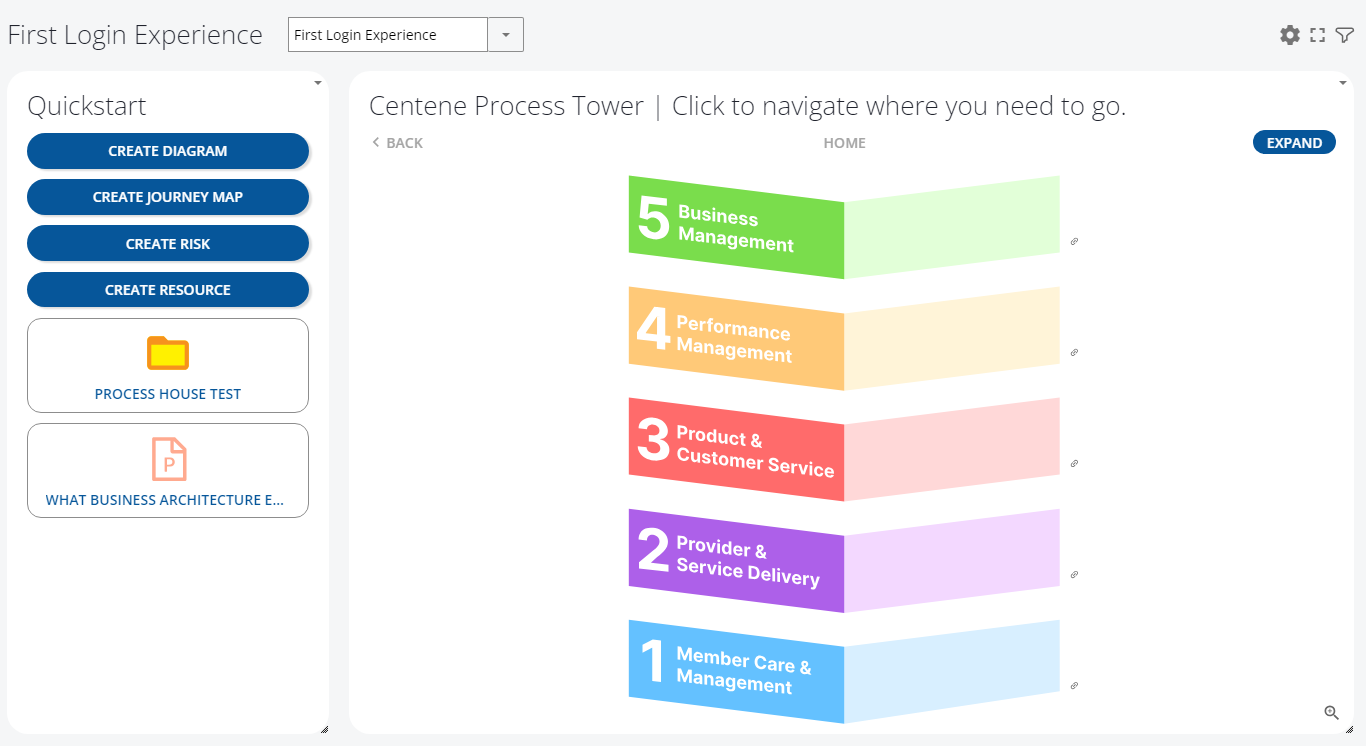
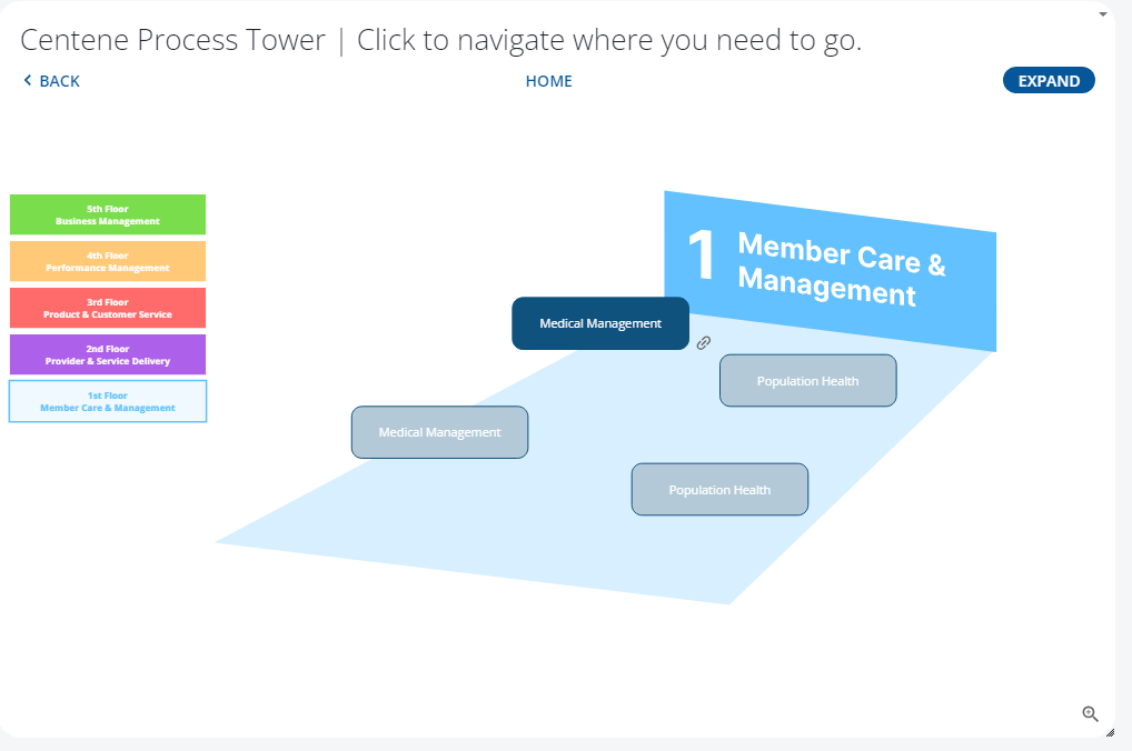
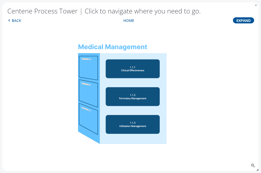
The gallery below shows the initial prototype dashboard, and the successful import and linking tests.
Navigating a Process House
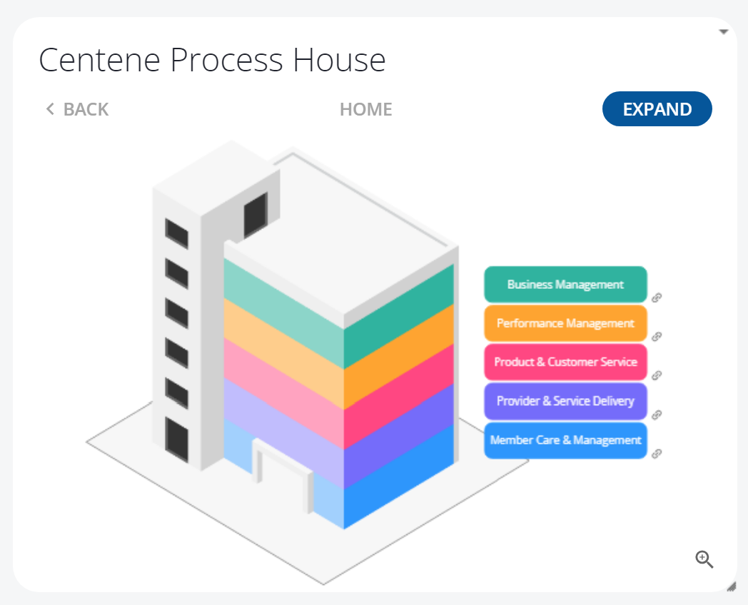
- Process Houses are like a nesting doll of diagrams. The top level is the organization’s value chains, depicted here as a building.
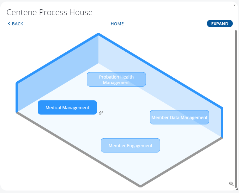
- Clicking a floor, in this case Member Care & Management, takes you to a child diagram with desks, shelves, cabinets, with relevant capabilities.
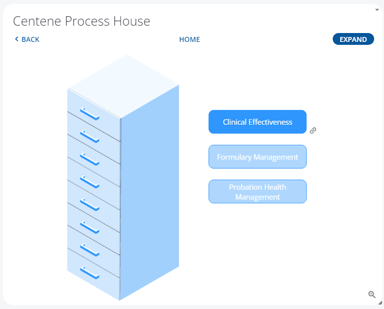
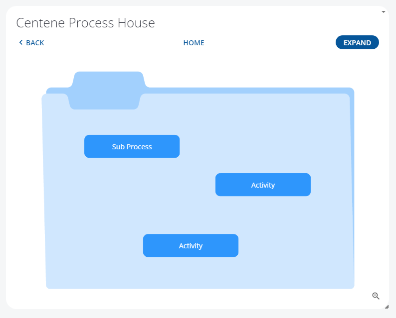
- Opening a filing cabinet will reveal lower level capabilities, functions, and processes. Clicking these will navigate you to the content itself.
Process House Usability Testing
After creating the simple prototype in iGrafx using PNGs quickly created in Figma, I started to run power-users and relatively inexperienced users through the experience of clicking into and out of this process house structure. Running users through a Usability Test Rubric I developed, Of the 20 users tested, task completion rate was excellent. 90% of users found the cabinet with little resistance, and navigating back to the top level with ease. Those who got stuck didn’t understand the floor illustration was the floor of a building. Once they found the cabinet it all clicked and they navigated with ease. Note to self: future rough prototypes should maybe be a little less rough.
Every user tested loved the idea of a color-coded, landmark-based navigation scheme to help them drill into the content they needed.
Rolling Up The Sleeves
The project takes a turn here. iGrafx dashboards are only as useful as the data it has to display. With the messy implementation of iGrafx, there was no consistent or robust data or models to work with. After reconnecting with my director and our stakeholders, leaders from the other teams, it became clear that we needed a dashboard that serves as an entry point for a mock model showing the software’s full potential. I had to put on my Business Transformation Manager hat and start modeling.
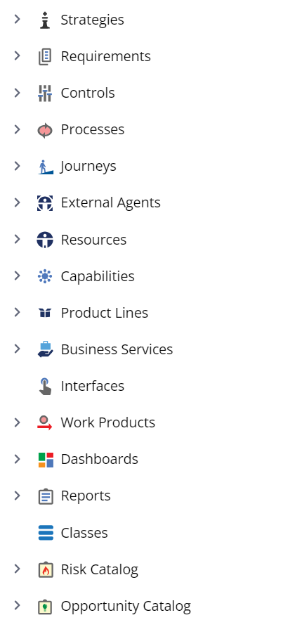
iGrafx provides building blocks called Enterprise Objects. These are data elements that represent real business concepts: Goals, Strategies, Capabilities, Risks, Controls, Processes, Resources, etc. The basic exercise is to create these kinds of objects, fill them in with relevant business information, then take advantage of the linking, relationships, “describes”, and other relational architecture built into iGrafx to start interconnecting these objects. Before long you have a decent model of an organization.
Many of our users were very familiar with iGrafx and had created very robust diagrams, but that’s usually where their work ended. This was the first time users had seen what iGrafx can really do. This work also lent itself to the greater department work of evangelizing BPM as a discipline to the wider organization.
Back to the Dashboard – More Prototypes
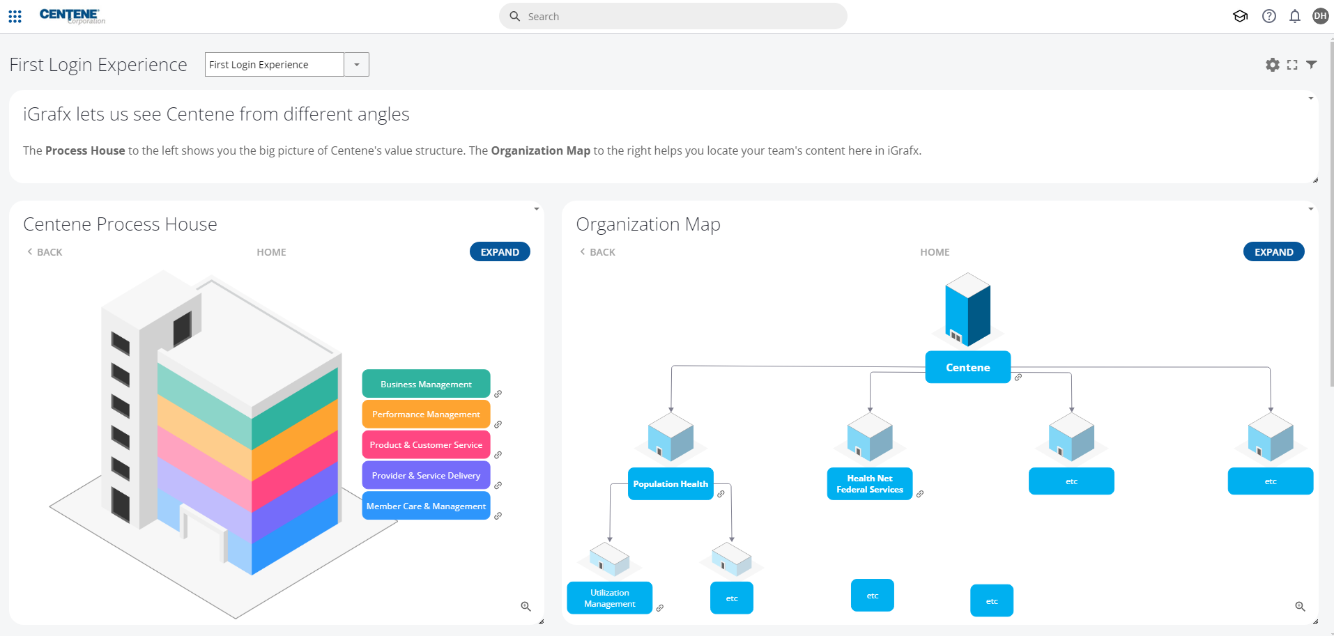
With plenty of mock data to work with now, the first view I wanted to create was a first login experience. This dashboard would be default for all new users so they can see right away the structure of the model they just logged into. It allows the user to explore the organization chart, and start to get to know the capabilities of their organization.
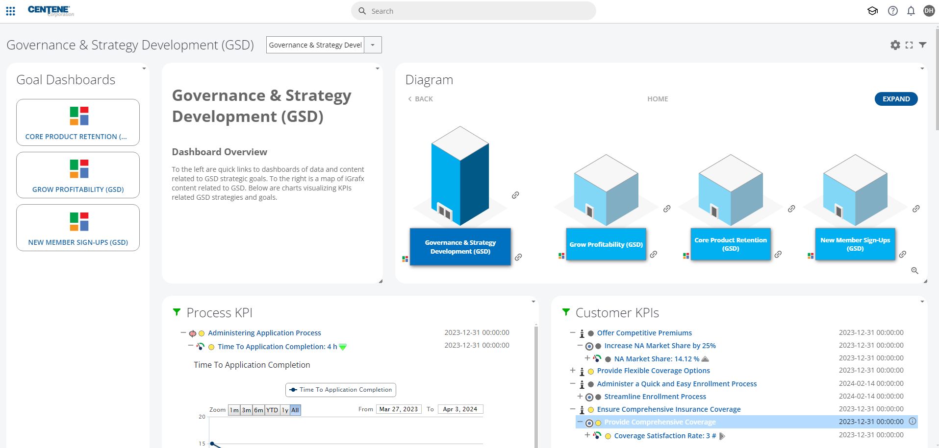
The second view is more of a leadership dashboard for roll-up metrics and cross-department navigation. The goal was to give teams summarized views of their business area, with plenty of entry points to drill down into specific process, capability and resource data.
Process House Visual Design
While working on the dashboard itself, I would take breaks to do the most fun part! Illustrating furniture was a blast. And I got a chance to brush up on my isometric illustration skills.
The gallery below shows the revised buildings, floors, and cabinets.
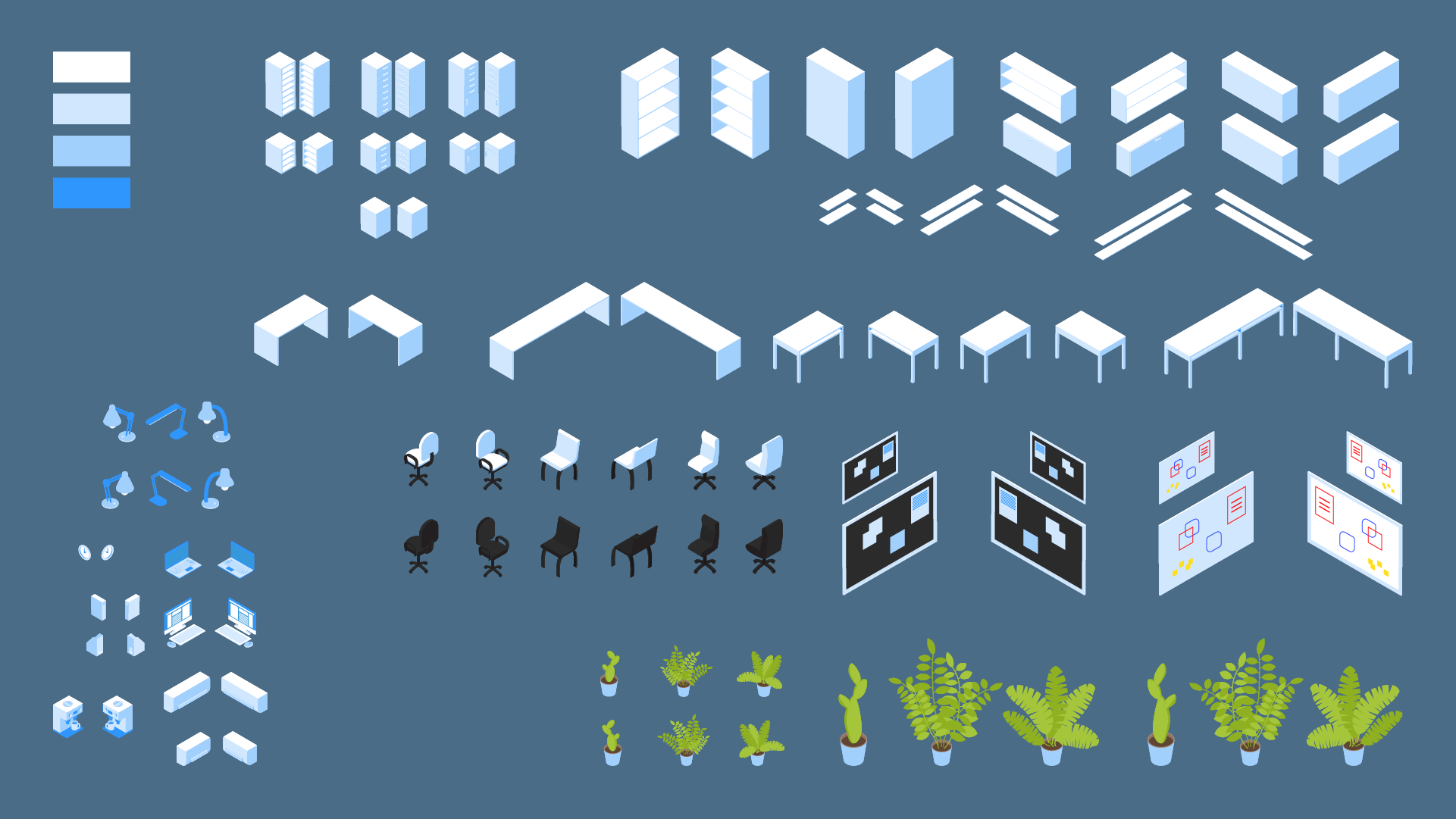
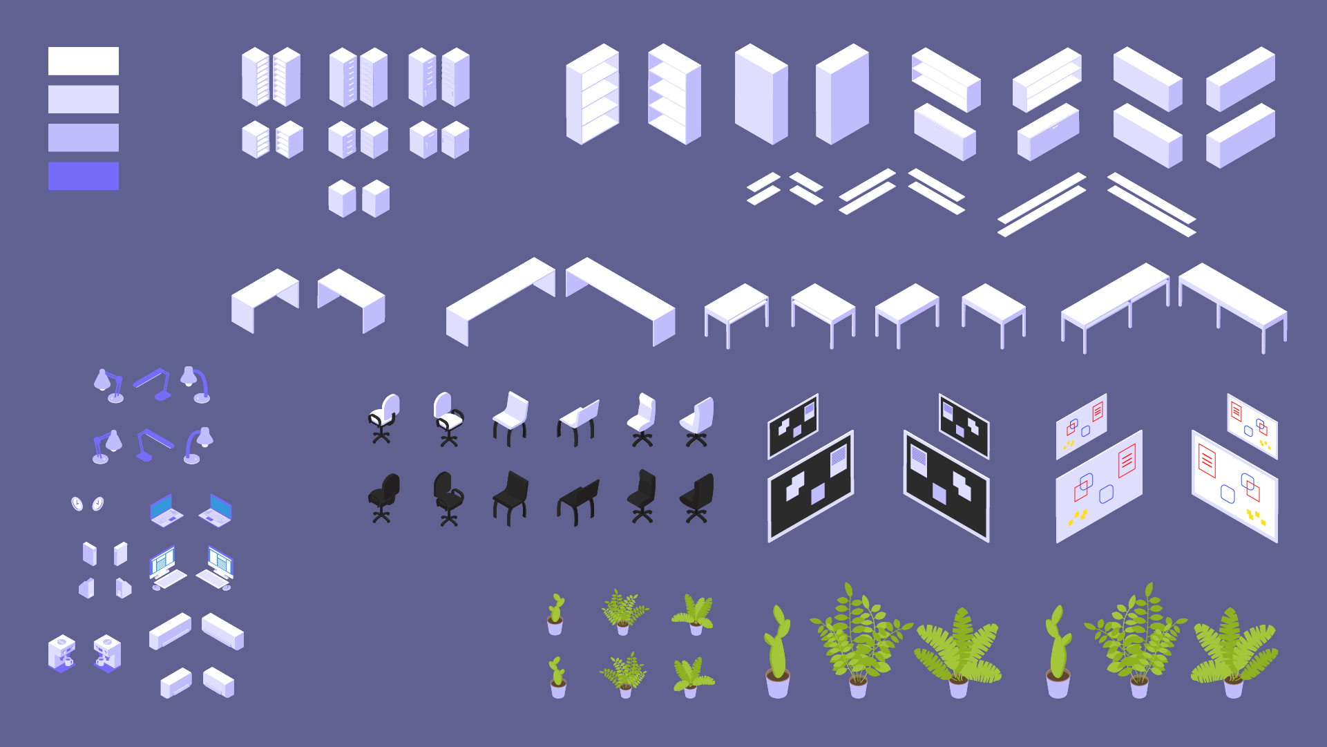
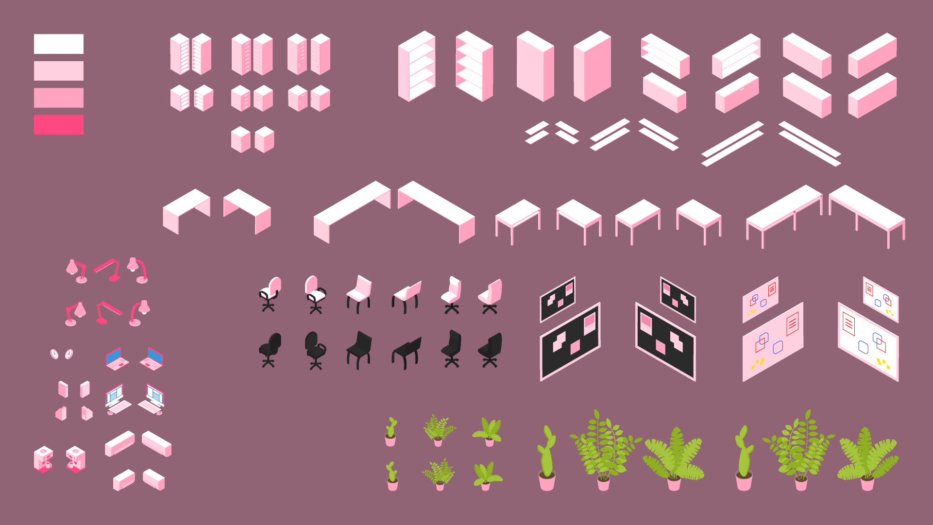
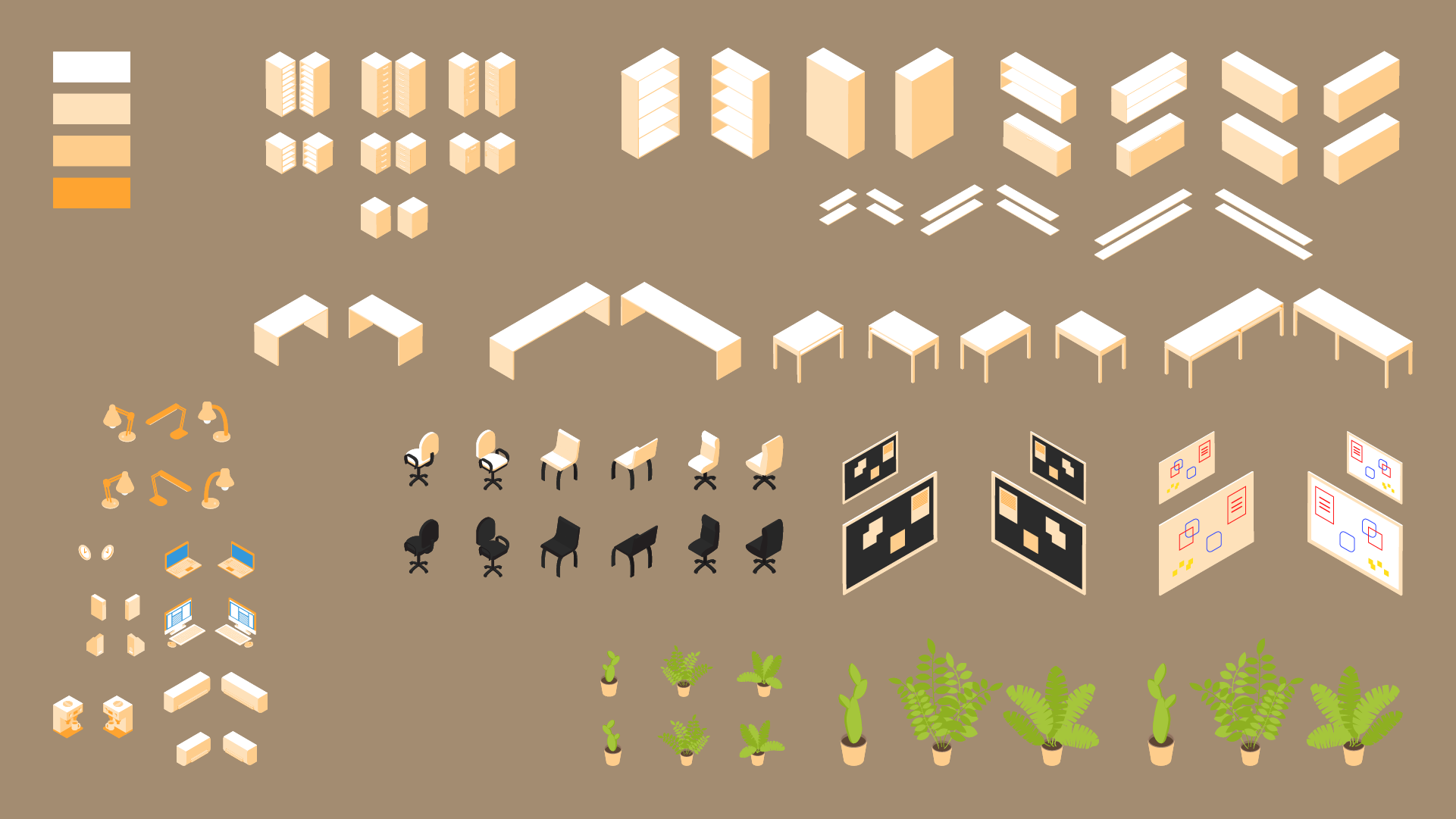
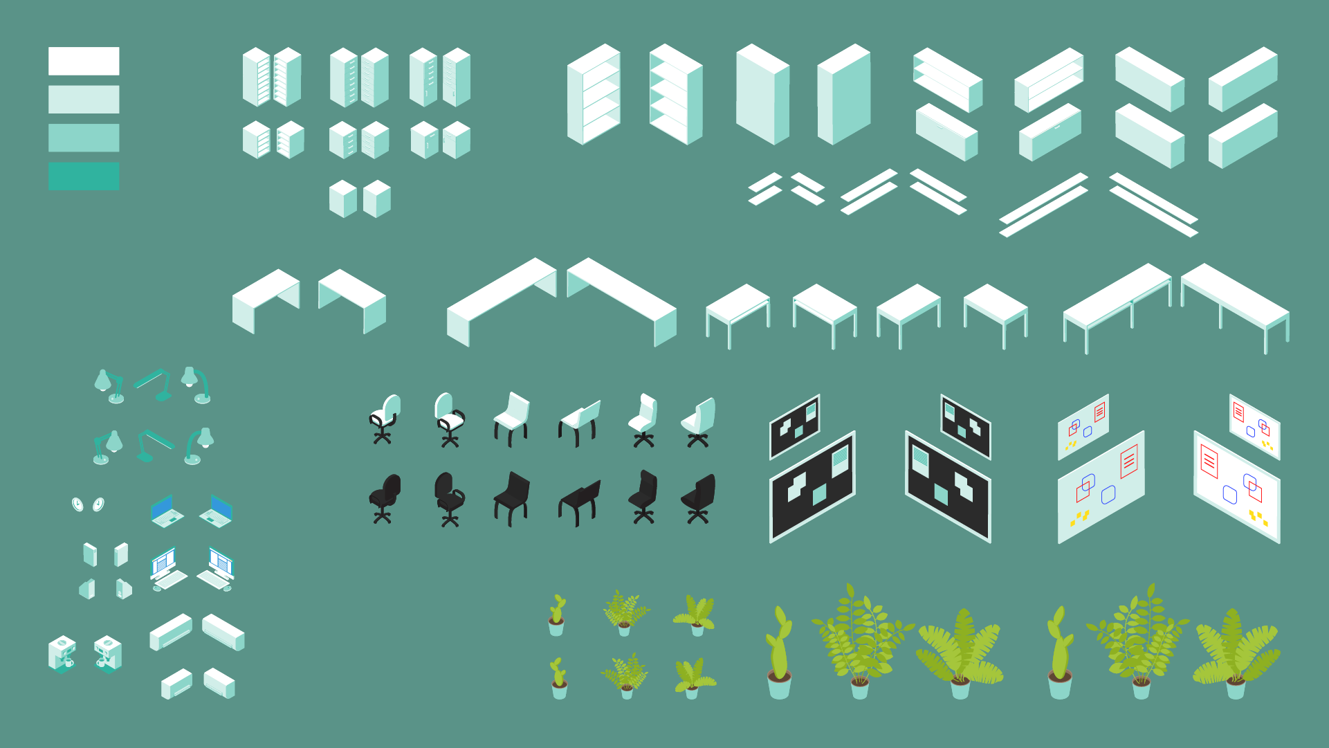
This next gallery shows the sprite sheet for furniture, color-coded to each floor.
With these sprites, teams managing a vast array of different business areas can drag-drop shapes into the diagramming area, put together what the landmarks for that team might look like, and place iGrafx shape objects onto them for convenient information access and recall.
Result
This project is ongoing. The work now is to consult with teams of users, define the scope of their content, help create schematics of their organization, its capabilities and process structure, then build them a set of dashboards that will be attractive, accessible, and most importantly, easy to navigate.
A major component of this work will be enabling teams to self-serve. They may not always have a graphic designer, illustrator available to design up these nice things. So how can I provide these assets with appropriate training materials so teams across the large corporation can continue to have attractive, consistent, effective navigation systems? That is the subject of my ongoing work.

Get In Touch
Let’s Make
Something Great
Dillon Hall
My name is Dillon Hall, and I am a creative professional living and working in Portland, Oregon. The work showcased here serves as an example of my creative capabilities as a brand developer and creative problem-solver.
