GOOGLE UX CERTIFICATION
Fitness Tracking App UX
I worked to formalize my design experience with the Grow With Google User Experience Design certification on the Courseera platform. The certification taught me the latest best practices in research, accessibility, pattern library management, and more.
My project throughout the certification was a mock fitness tracking app.
Project Background
While much of my professional experience centered around product design, Customer Experience (CX), front-end web development, enablement of B2B SaaS products, I never held a true UX Designer position, or had work framed in that discipline in my portfolio. I looked up certification courses to formalize my experience and landed with Grow With Google (GWG). I highly recommend the course to anyone who is interested in the discipline. No prior experience required.
The reason I decided to develop a mock fitness app for my certification is somewhat out of spite. I am a powerlifter and the tracking apps I’ve tried all miss the mark in a variety of ways. In this project I ideate and design my solutions to those problems, so at least I can dream of using a better app.
Mind Mapping
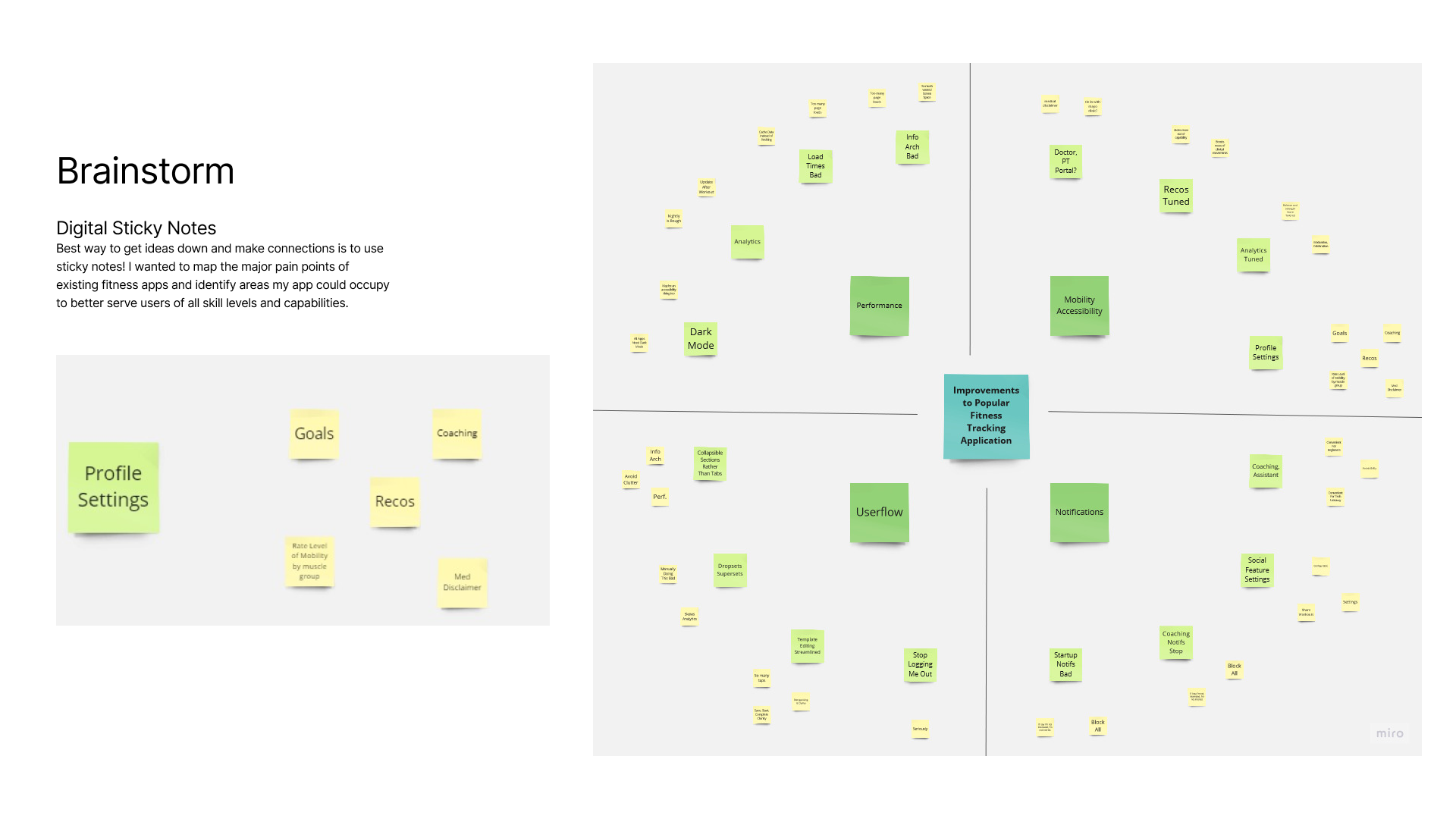
Based on my experience with the top fitness apps, interviews with my friends and coworkers who have used similar apps, and my exploration of reviews and discussions online, I developed the following map of common user pain-points and key features.
User Flow
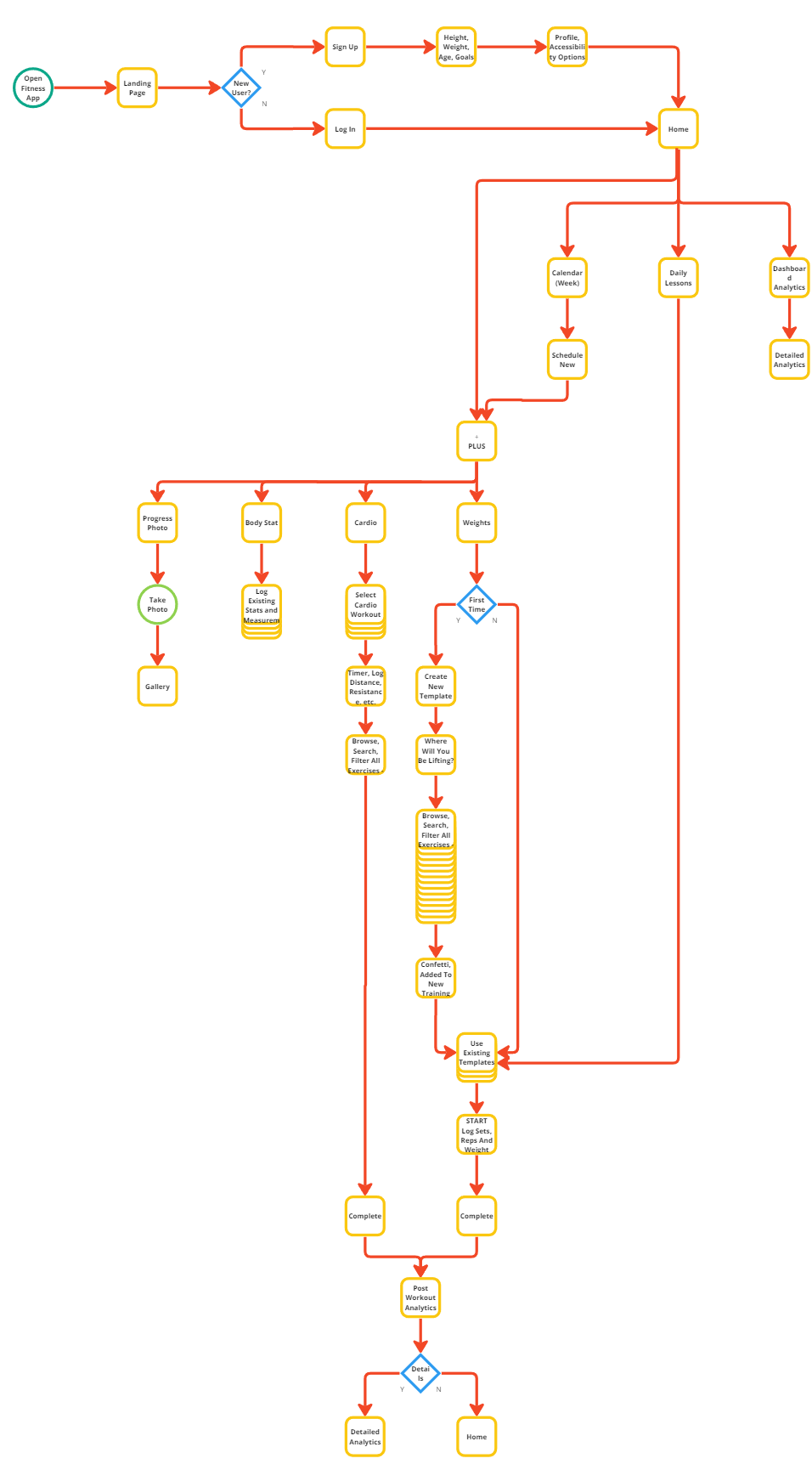
The basic bones of many fitness apps are fine. After a lite login experience and initial profile creation, they provide a high level landing page with access to broad feature areas. The primary features are the workout tracking tools. Where many apps fall short is the flexibility of their templates. Having to manually recreate or adjust workouts each time is painful. Some apps have this solved but don’t take it far enough – being able to pull from user-stored data related to activities and movements is critical. Rather than wonder what my last weight was on incline bench 2 weeks ago, it should provide smart recommendations from this user data.
Wireframes
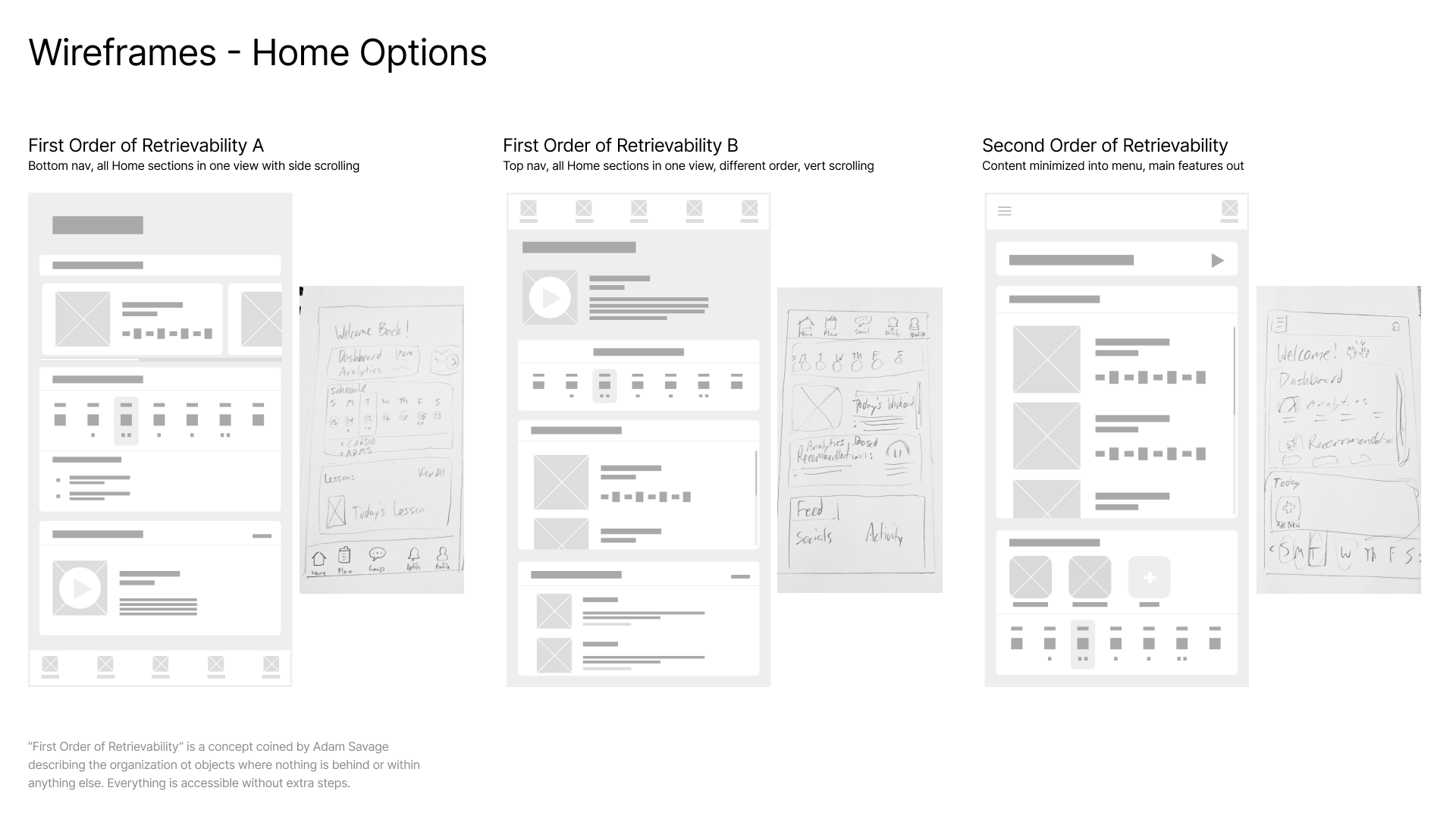
As with most applications, the challenge is providing an approachable hierarchy of information that minimizes clicks, but doesn’t clutter the user’s view with noise. I wanted each view to have lots of value, but be nicely separated into convenient buckets of information with the option to dig in further. Below are my attempts at the landing page view, immediately after login and profile creation.
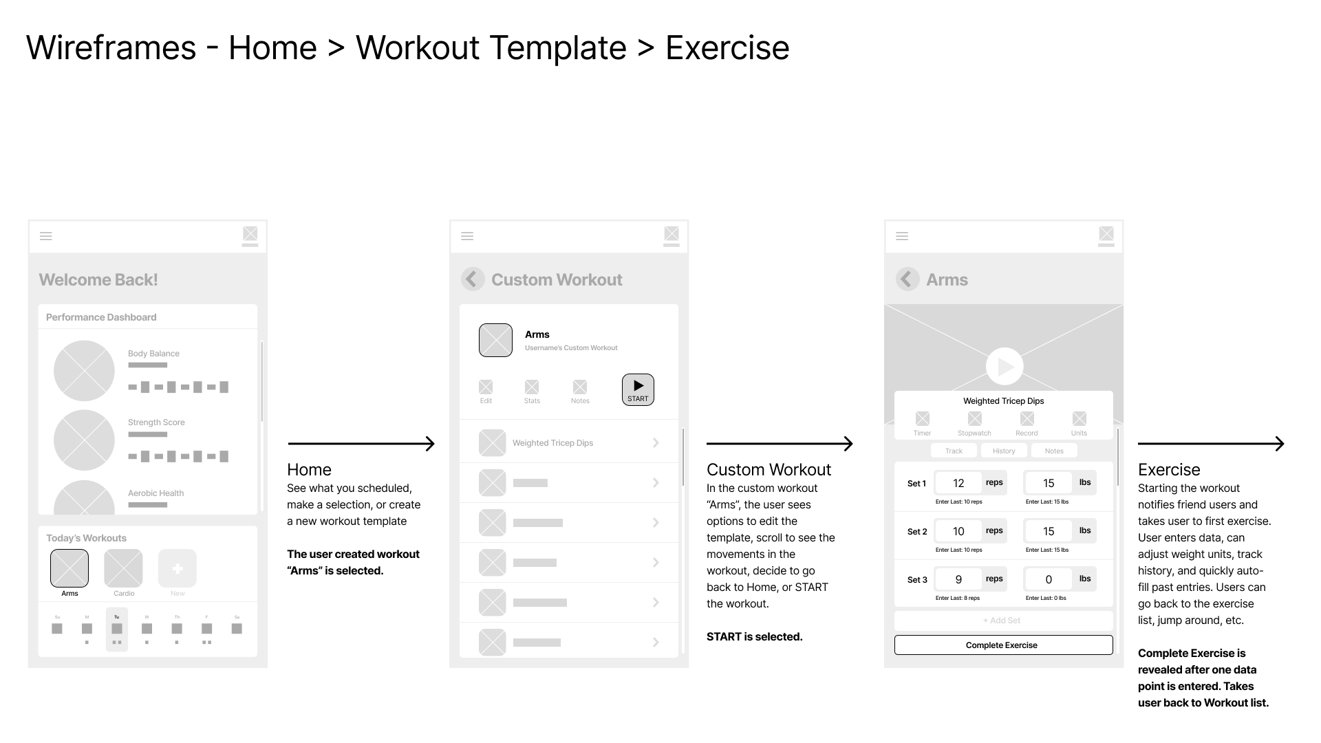
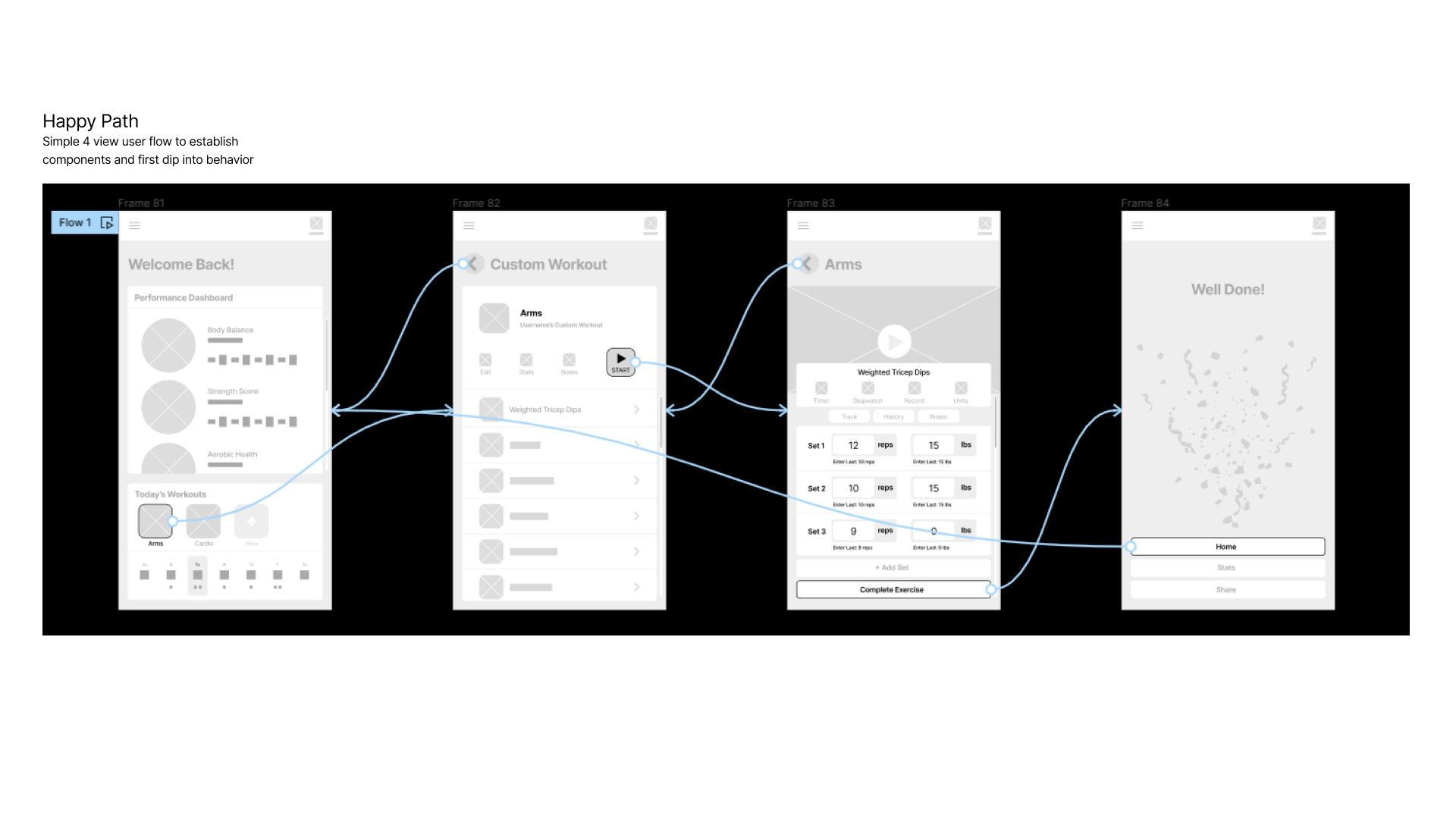
The following wireframe covers the primary functionality of the fitness application. Tracking, templatizing, and editing are crucial for an app that lets the user store robust data without interrupting their workout.
Prototyping
With the templating experience laid out roughly how I thought it would work, I embarked on user testing with a functional prototype. In Figma, I wired up my prototype with buttons, connections, cross-links and other critical functionality. I then ran close to a dozen of the original people I interviewed in the research phase through the prototype. Feedback was universally positive with only minor confusion surrounding data entry. When they read the caption beneath the reps and weight which says “Enter Last…” it became clear to them that previous user data could be reused as a quick starting point. Success!

Get In Touch
Let’s Make
Something Great
Dillon Hall
My name is Dillon Hall, and I am a creative professional living and working in Portland, Oregon. The work showcased here serves as an example of my creative capabilities as a brand developer and creative problem-solver.
